Introduction
Netlify's developer ecosystem
Netlify is the number one development platform for building, deploying, hosting, and managing web applications. It offers a suite of tools that streamline developer work flows and eliminate repetitive engineering tasks. In 2021 they approached me to help them build out their design team, redesign and integrate their latest acquisition (OneGraph), and build them an integrations marketplace, to make plugin discovery more accessible.
Challenge
Designing a complicated tool
The OneGraph service makes building integrations with services like Salesforce 100x faster but the product had never been touched by a designer. It needed to integrate properly with Netlify I was responsible for creating all of Graph’s new product design.
Process
Brainstorming API interactions

Graph Settings

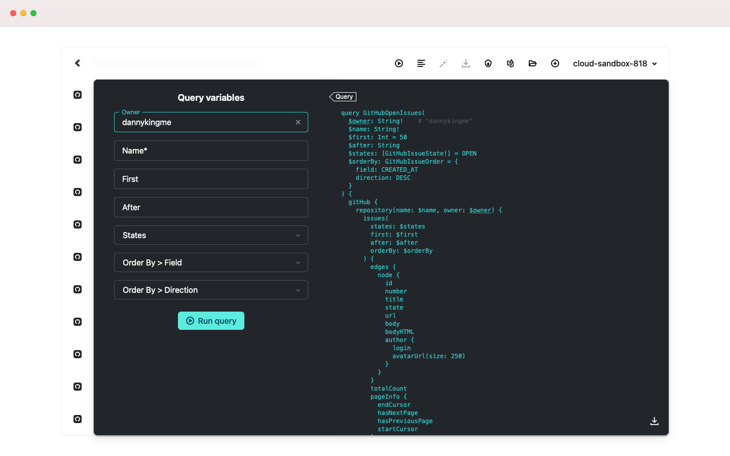
Graph Example Code

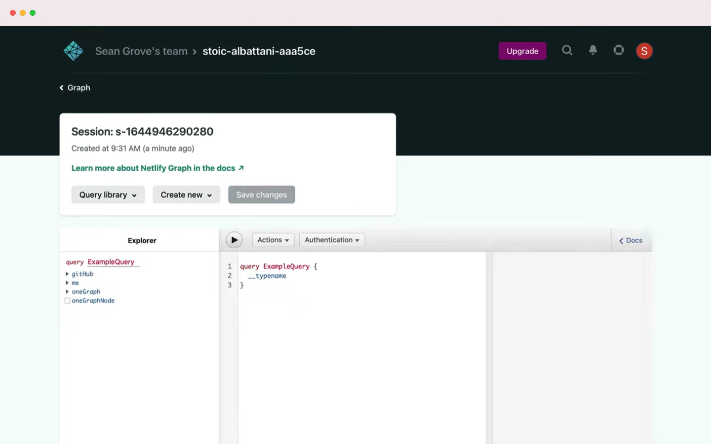
Graph Sessions Dashboard

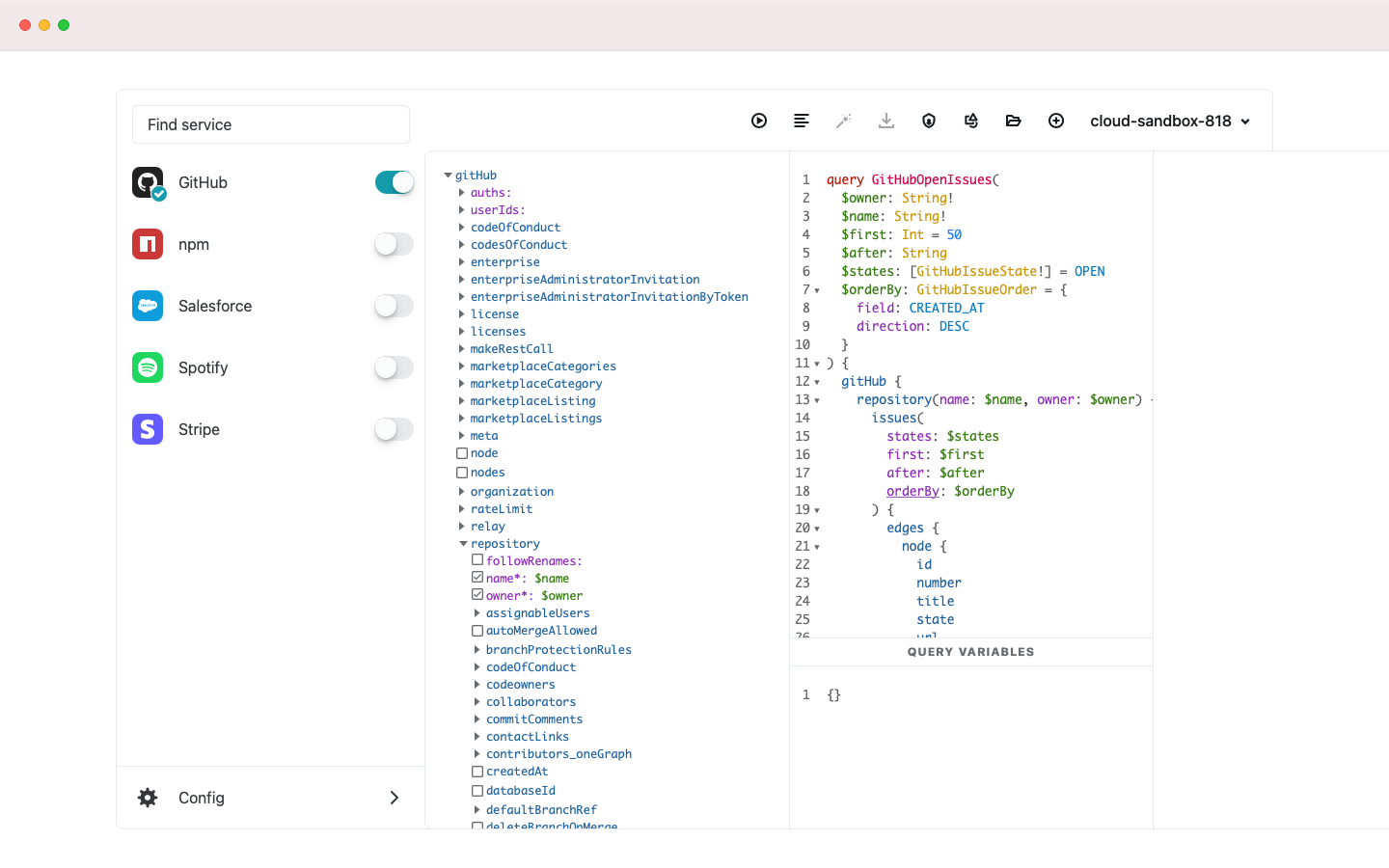
Graph Services Menu

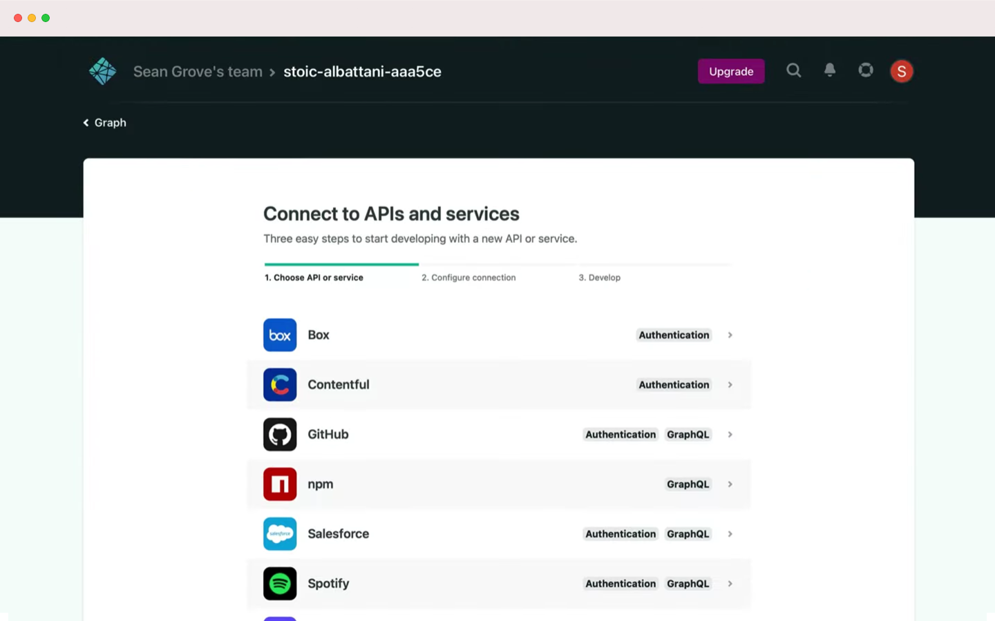
Graph Services Catalog
The biggest challenge that Graph’s design initially offered was a cumbersome onboarding wizard users were dragged through before they were able to see any services Graph had to offer. The first thing I experimented with was a unified interface that previewed what Graph had to offer right away, but still offered a step-by-step process to onboard into very technical product.
Solutions
Graph services list
My first priority was putting the various API partners front and center. Focusing on these established brands helped build trust with new users and immediately gave partners a sense of belonging in the app.
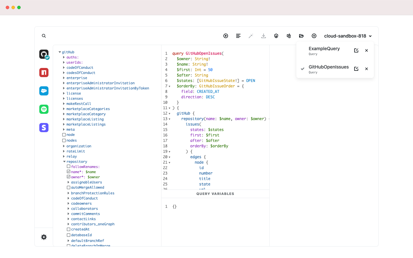
Graph code examples
Searching for new services which were previously hidden became delightfully simple, and exploring code examples became fun enough to incentivize users to explore.
Graph toolbar options
From there I built a toolbar to house many of the features that were previously left floating on the page. This became Netlify’s first foray into an app-oriented design, rather than a content-oriented design.
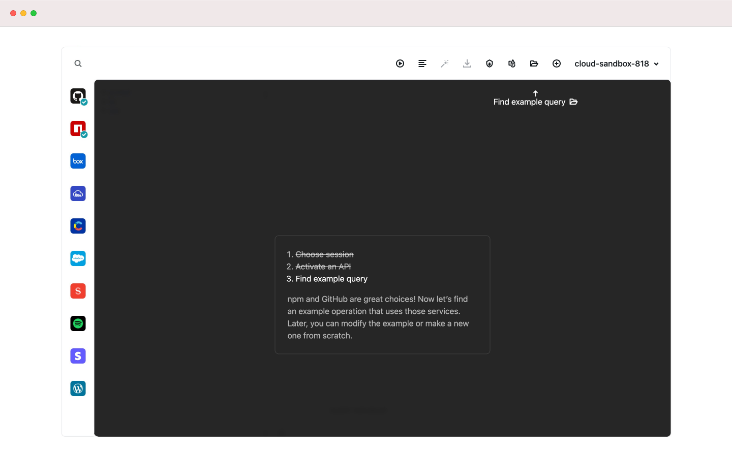
Graph onboarding
Finally, I created a step-by-step onboarding flow that explained the most important features, without ever removing you from the product itself.
Challenge
A fractured ecosystem
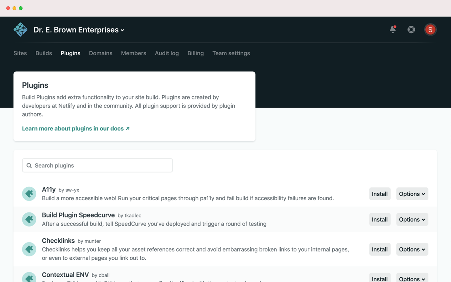
The future of Netlify is bringing developers closer to their tools. With hundreds of partners, plugins, services, and tutorial articles, Netlify has a vast ecosystem. They needed to create a centralized location to maintain current integrations, encourage innovation, and track usage. I was tasked with creating the design for their marketplace.
Process
Prototyping a vast ecosystem

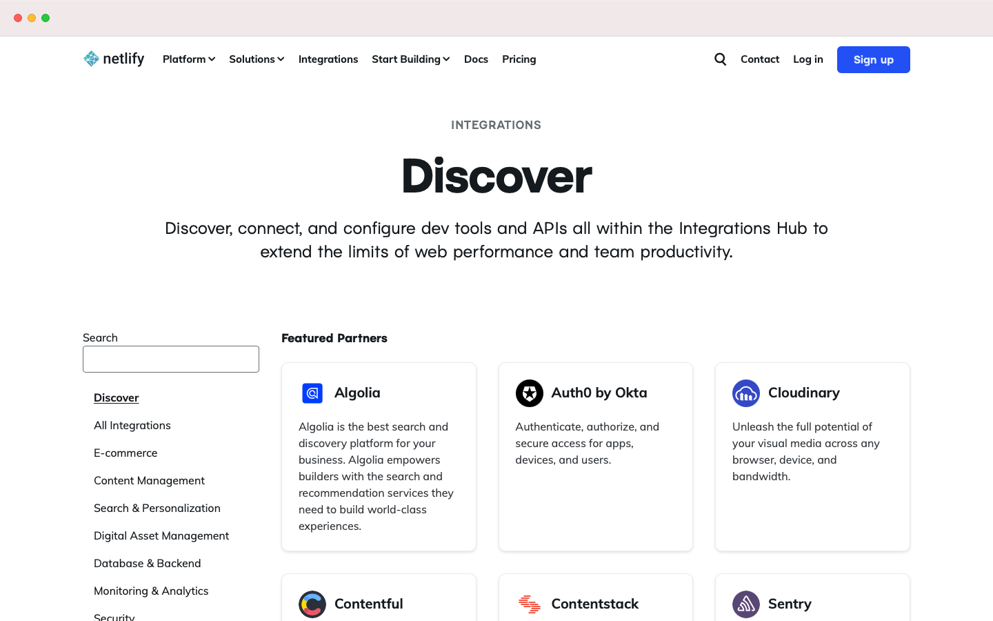
Integrations Toolshop Homepage

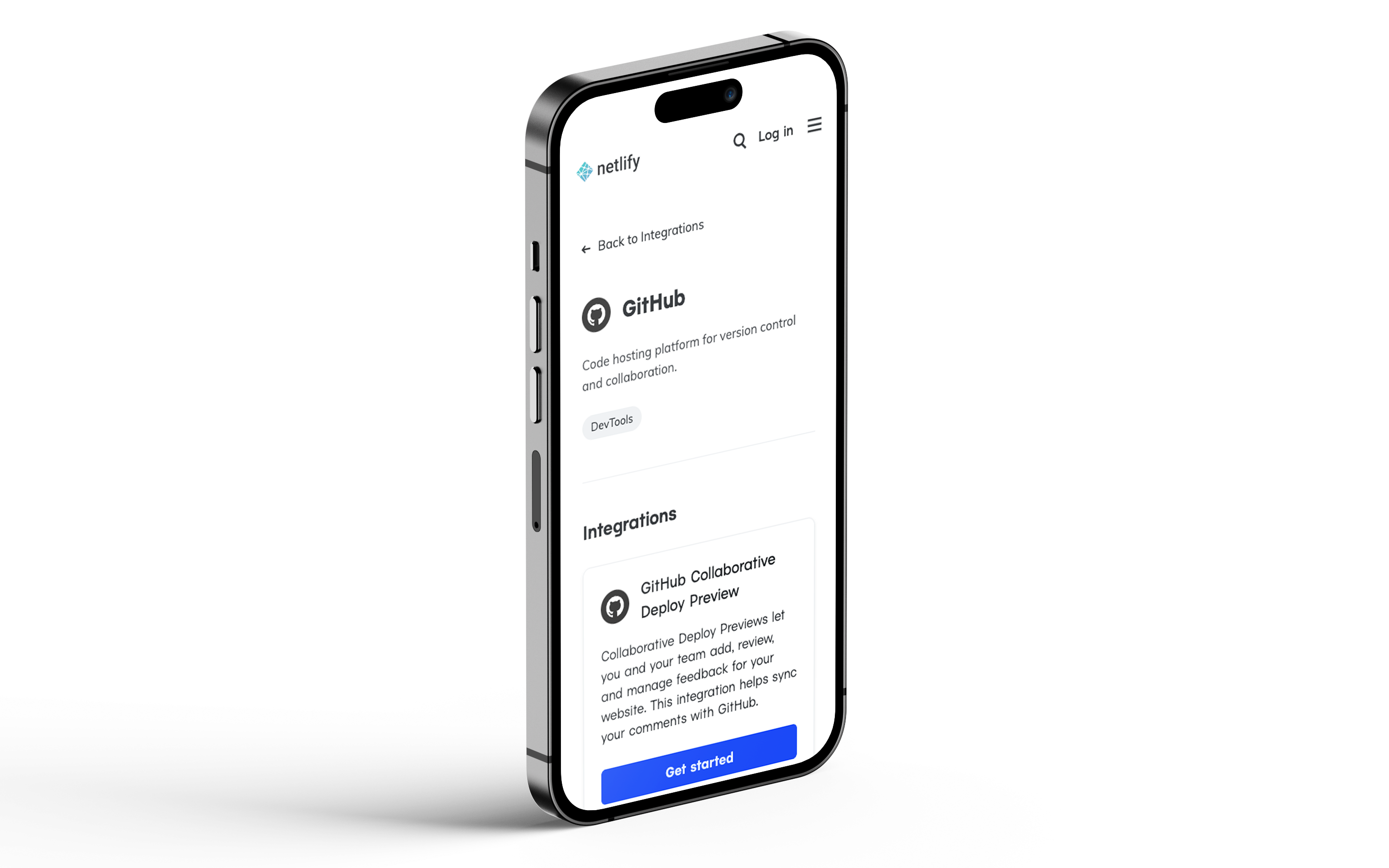
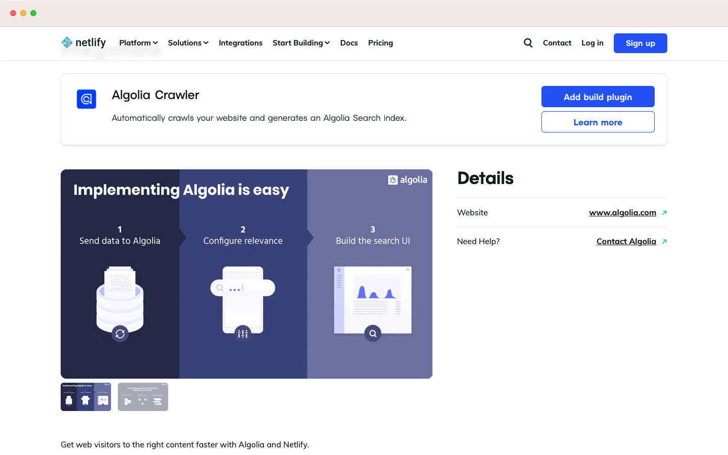
Integrations Details

Integrations Simple Homepage

Integrations API Services
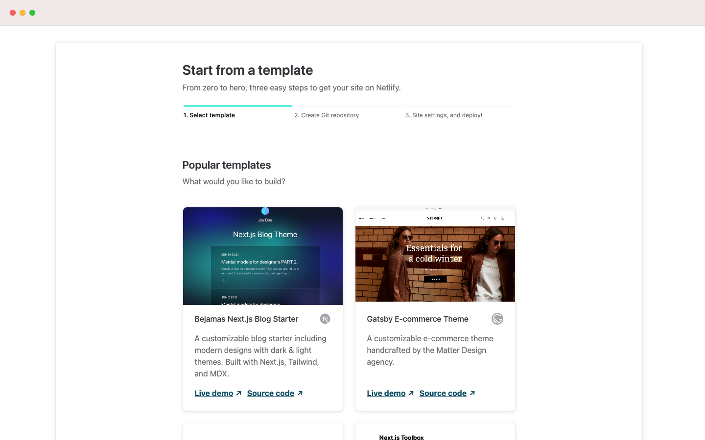
For their marketplace, Netlify needed a gallery view with partner logos, a details page with instructions, and a button to initiate the integration. Integration marketplaces are fairly common today, so I focused on what could differentiate us: the story. By promoting all of these different tools, Netlify was, in a sense, building a hardware store for people’s software; so I melded these ideas to create the toolshop.
Solutions
A new hub for integrations
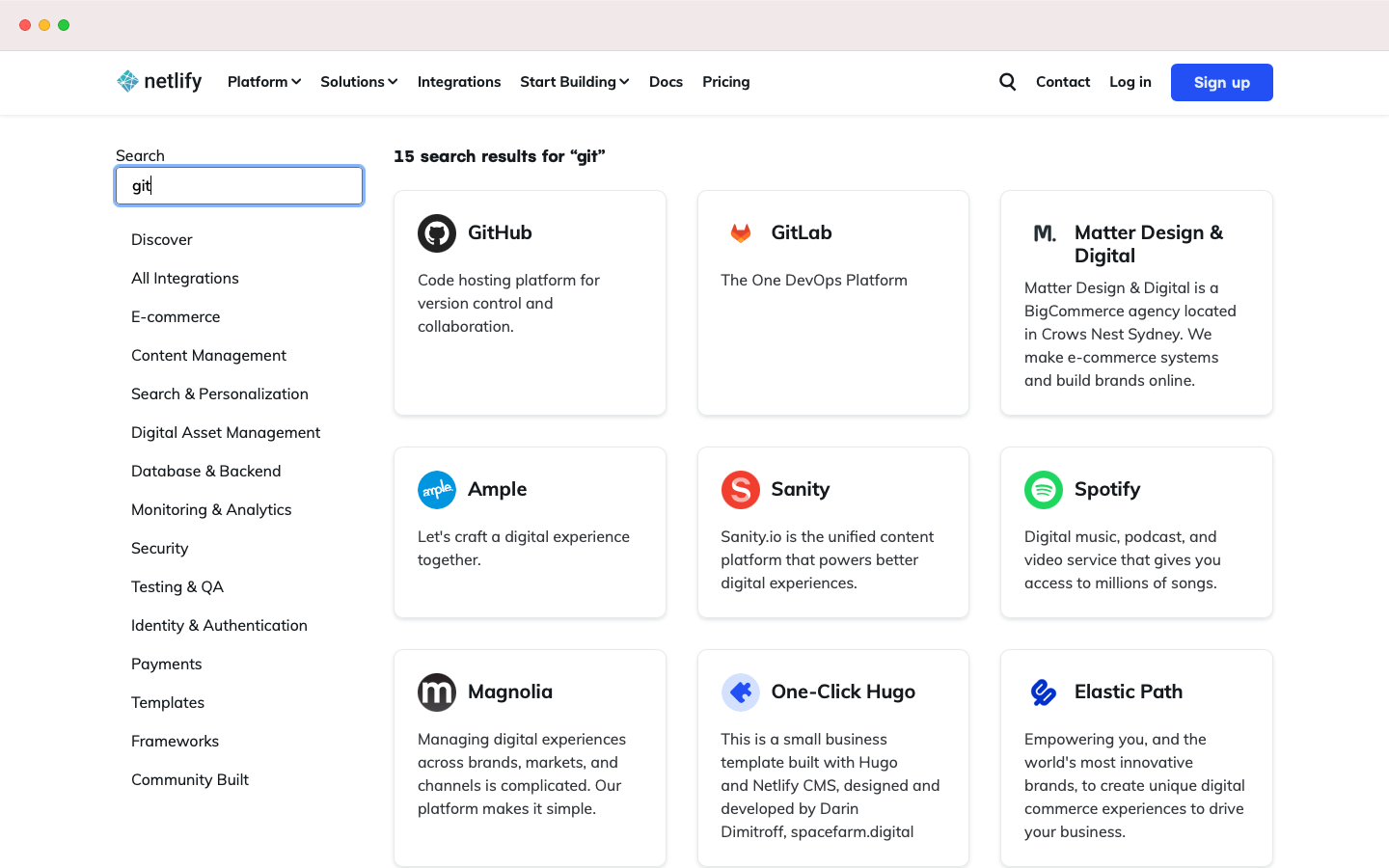
Discovery and innovation became my main priority for integrations, so search was key. The amount of integrations could be overwhelming to a user, so designing an easy to use search would encourage exploration. You could even search for integrations using the global CommandBar, which worked great on mobile.
Integration discovery
While I didn’t want to completely overhaul the marketplace paradigm, I designed and built several micro-interactions and delightful details to help Netlify’s offering stand out against its competitors.
Integrations search
Search queries do a deep dive into each integration's metadata to find recommendations that are relevent on a technical level.
Partner details
I designed and built a backend interface, using Sanity, to enable select partners to customize their details using a simple, drag-and-drop interface.
