Introduction
Fixing collaboration for product teams
Precursor is a wireframing tool that helps teams focus on their ideas. I started the company in 2014 with my cofounder, Daniel Woelfel. After launch, Precursor was featured as the #1 story on Hacker News, Product Hunt, and Designer News, and reached 200k new users after six months of development, with no marketing.
I built Precursor to solve problems in my own workflow. I was tired of holding pencil sketches up to my webcam and getting distracted by my wireframing tools.
Precursor became one of the first multiplayer design tools. Fast forward a decade, and the multiplayer features that made Precursor unique are now very common in tools like Figma, Adobe XD, and InVision.
Challenge
Design tools chaos
Back in 2014, wireframing tools were not very easy to use or collaborative compared to the tools available today. Most prototyping was still done in high-end design tools like Illustrator, or slightly lower fidelity tools like Balsamiq. Neither worked well for me—Balsamiq still offered too many options that distracted from the problem being solved, and the hand-drawn aesthetic would trick my teammates into thinking this was a style I settled on for the final product.
My goal was to change the way people shared their ideas.
Process
Dogfood inception
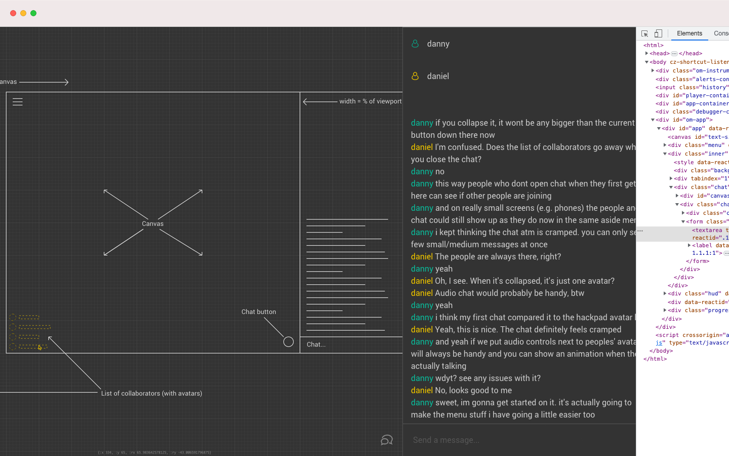
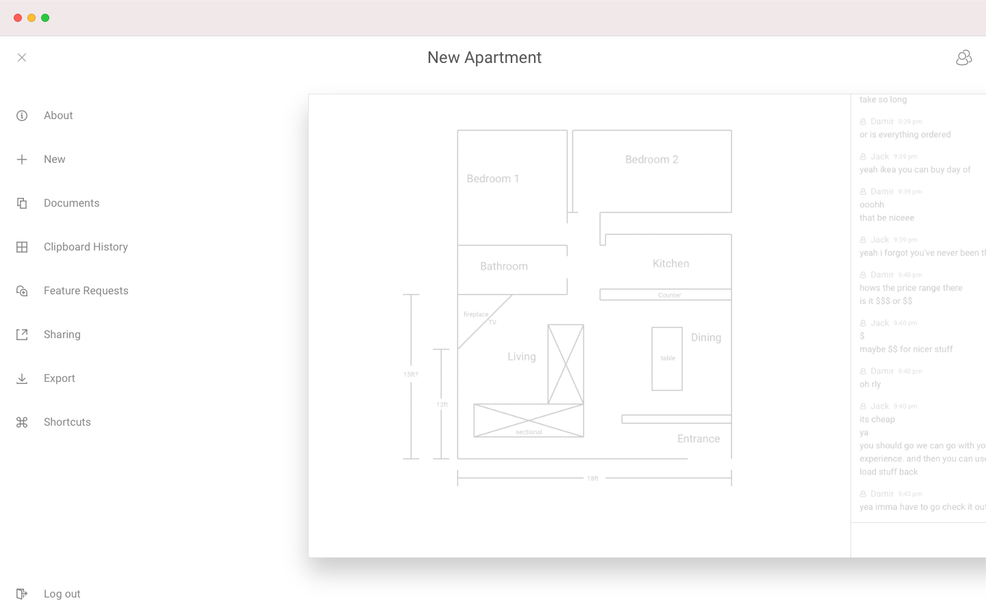
I’ve always prioritized dogfooding my own products but Precursor brought this to another level. In this alpha version of Precursor, Daniel and I are discussing a significant UI change. I’m waiting in Chrome, with my Devtools, to prototype it. Precursor provided the static wireframe but it also served as a dynamic guide for my development workflow.
We didn’t use Precursor to simulate our users’ needs. We relied on Precursor to collaborate with each other and build our product.
Evolution of menus
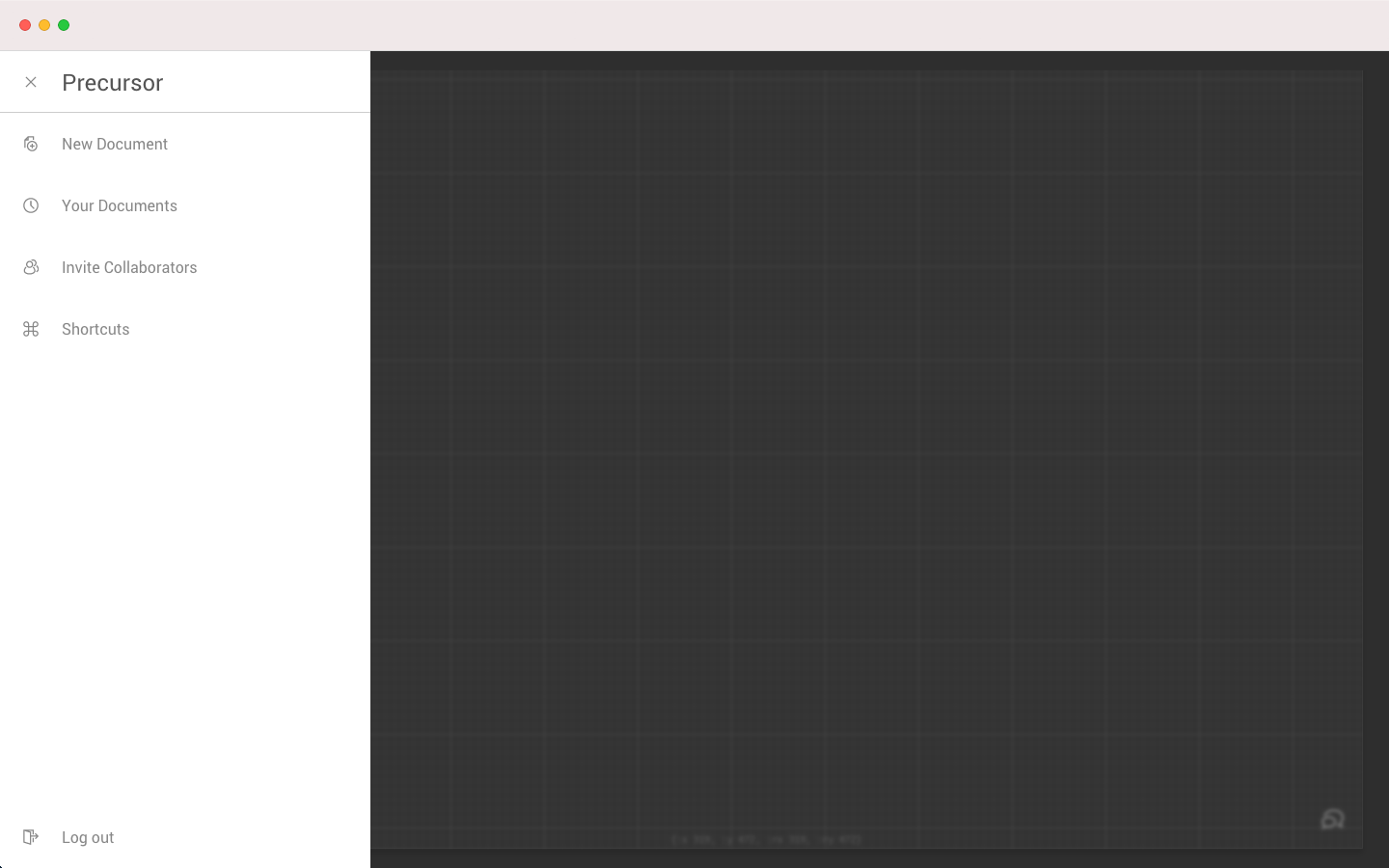
The earliest version of the main menu was simply a list of users in the document. We needed a chat feature so the list of users and the chat squeezed into a single sidebar. Then, I added a new menu that slid over the top of the canvas.
The final version of the menu simply pushes the canvas over. Once I realized that the menu was a distraction from your ideas, I changed the background color and kept the canvas in-view so you never get too far away from your idea.
Solutions
Multiplayer collaboration
Precursor was one of the first design tools that was built with real-time, multiplayer collaboration. With multiplayer, every user has a shared sense of place. Users can manipulate each other’s designs in real-time, but they could also see each other’s cursors while changes were being made, and even chat via voice or text.
For most of our users this was their first time experiencing a design process like that, and it really added to their sense of teamwork, especially those working remotely.
Radial menu
Precursor’s appeal lies in its simplicity, and much of that simplicity is due to its lack of distractions; you can’t fill in shapes, you can’t add color or images. I make wireframes to get ideas out of my head as quickly as possible. Other wireframing tools have too many options that persuade me to spend more time playing with their tool than solving the problem I’m working on.
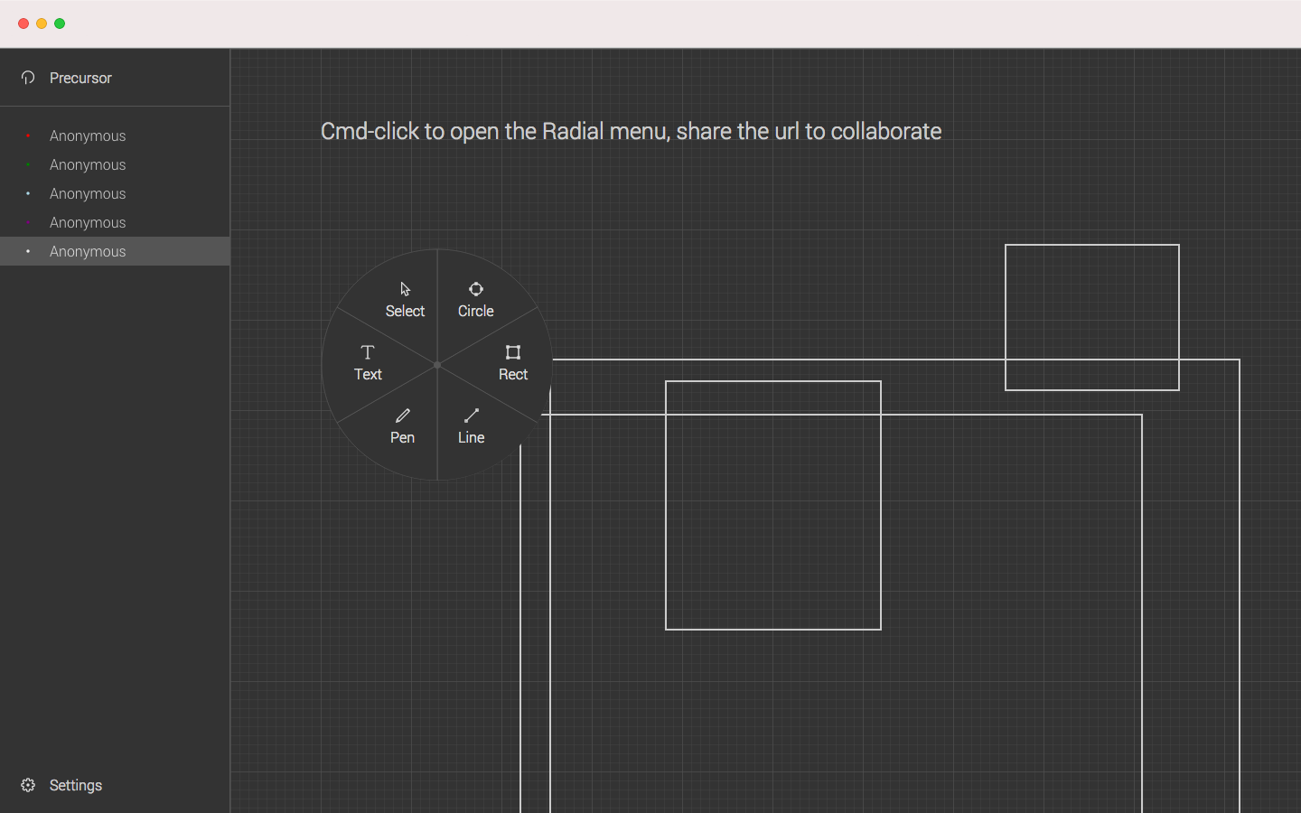
For Precursor, I limited the tools to the necessities. Rather than house them in a normal toolbar, away from your attention, I wanted them to be always within reach and easy to swap. That’s why I came up with the radial menu.
I liked the concept of radial menus after seeing them in video games, but while radial menus were somewhat common in video games back then, they were non-existent in the productivity/design space. Since Precursor’s launch, radial menus have become a popular design editor feature, making it’s way into other prototyping tools like Figma’s FigJam.
Document replay
Precursor used a lot of cutting edge technology at the time of its launch including React, WebRTC, and immutable database structures. This led to some unique product features like Replay.
Every action you make in Precursor is stored in our database as a part of an immutable data structure. This means we have data on which actions happened in which order, for every event, which gave us the ability to replay wireframes built by users automatically.
We used this feature to create a time-lapse mode, that any user can activate by typing “/replay” in their chat menu. This is a feature that continues to provide value to users even today. It enabled me to build the hover animations on my portfolio’s homepage.
