Introduction
The billion dollar gift card garden
There’s over $45 billion in unused retail gift cards in the world. PayGarden enables companies to accept gift cards from retail stores like Starbucks, Target, and Walmart as payment for products and services. In 2017 they approached me to help them improve their payflow product, redesign their visual language, and break into the gaming industry with a new product offering.
Challenge
How to earn trust
PayGarden acts as an alternative payment method for partners, so the opportunity to build user trust is inherently limited. The old payflow’s visual aesthetic was becoming increasingly dated, it didn’t adapt well to mobile, and our research pointed to the fact that our users didn’t trust the product handling their gift card balance.
My goal was to convert 2.5% more users, acquire 1% more preferred gift card brands, and lower support tickets.
Process
Userflow wireframes

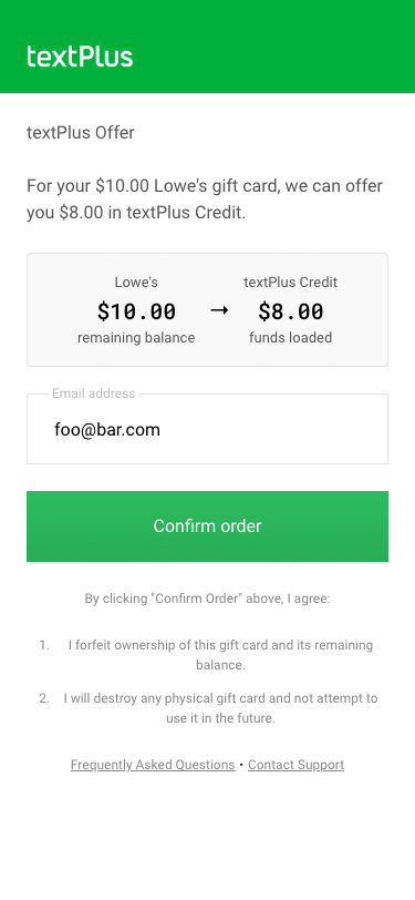
End-to-end Userflow

Multi-card Userflow

Card Details

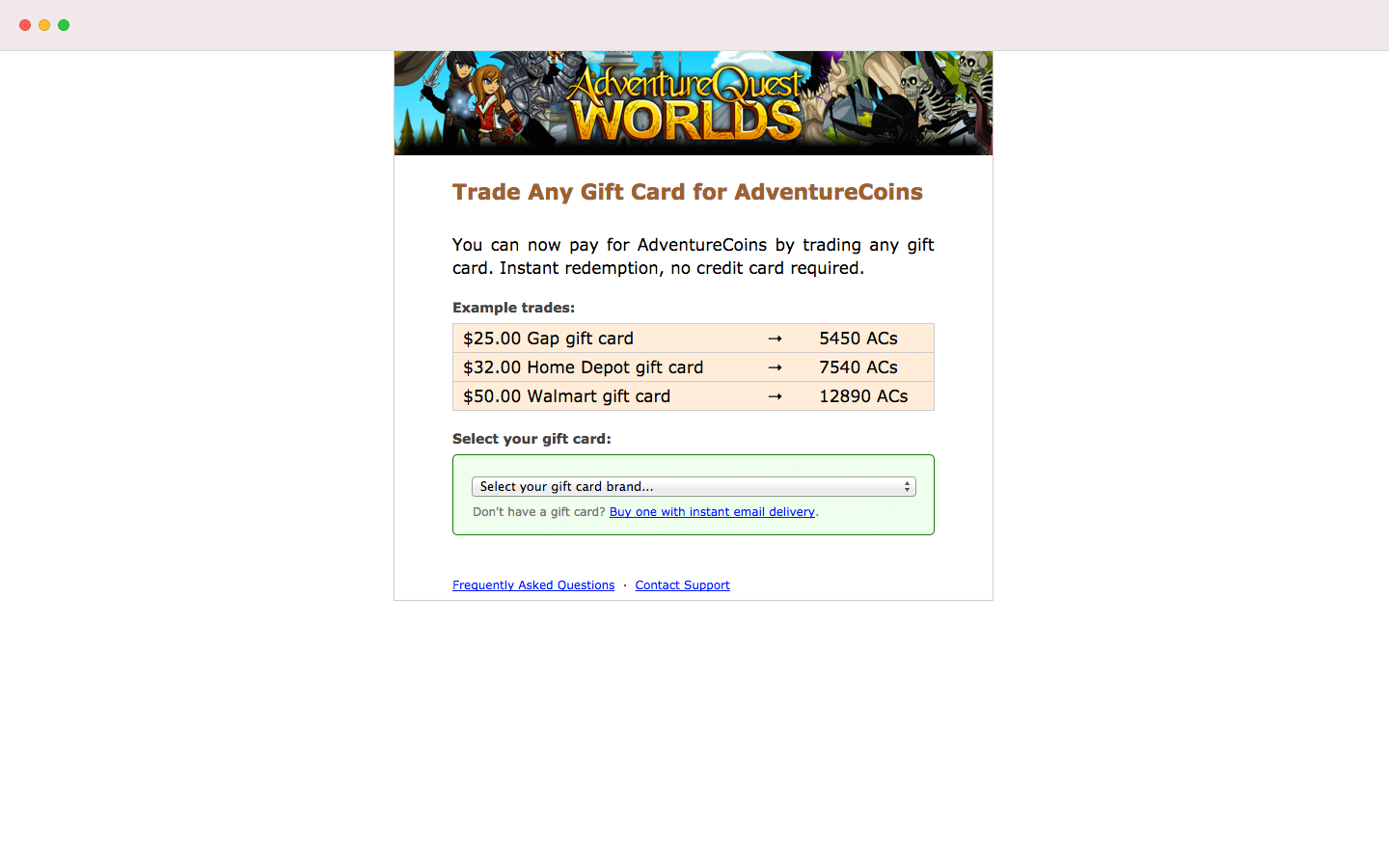
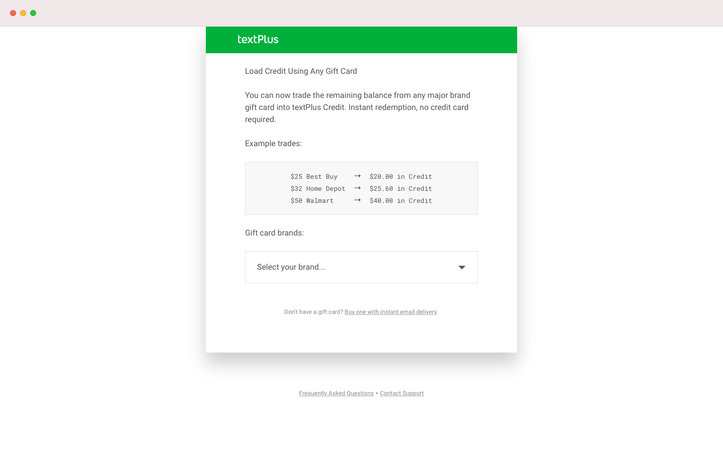
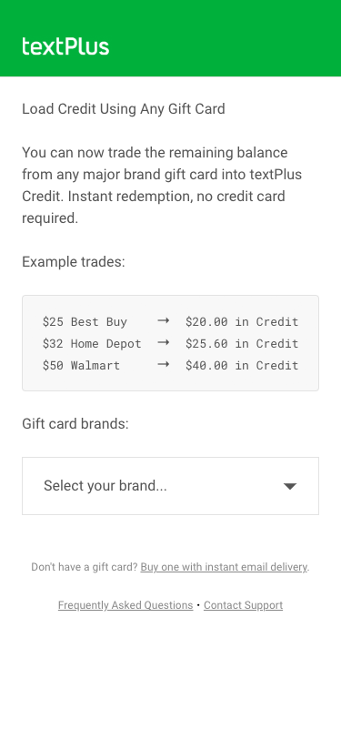
Example Trades
We had a lot of analytics telling us most of our users were on their phones, but there was no mobile version for the payflow. We had a lot of data on what gift card brands perform better with which partners, but no way to promote them.
My first step was to start experimenting with how we could promote the right gift cards with the right partners and make sure every feature, old and new, performed well on mobile.
Early iterations
My first iterations simply tried to clean up existing components. My goal was to stop the bleeding that was being caused by lack of polish and unresponsiveness in the layout. Color usage started to mean something and you no longer had to zoom in to read text on mobile.
This iteration served as proof of concept for something better and allowed us to ship something right away while still supporting our all of our partners' unique use cases. From there I started working towards a long-term vision of the user experience.
Solutions
Building trust
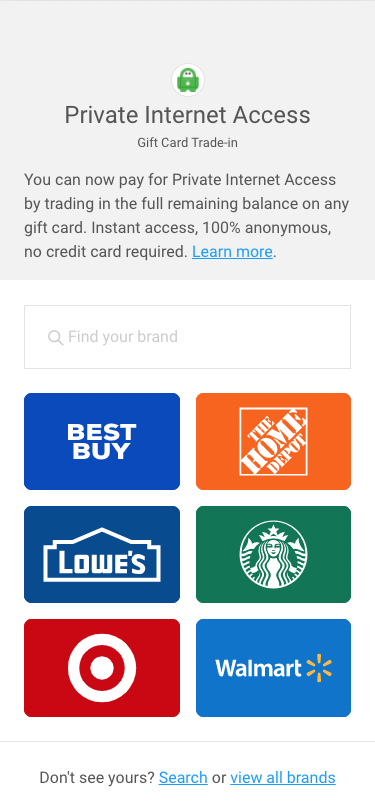
My strategy for building trust with our users started by leveraging the brand recognition they already had for popular retail stores. We curated a list of the six highest-performing gift card brands for each partner and put them right in front of the user. This gave us an opportunity to optimize our user experience based on user expectation and regional constraints.
Improving search
While most users were able to complete their transaction using one of the six gift card brands we promoted, the others needed a simple and efficient way to find the brand they needed. This led to a new search feature that empowers users to find the retail brand matching their gift card 10x faster than the old payflow.
Attention to details
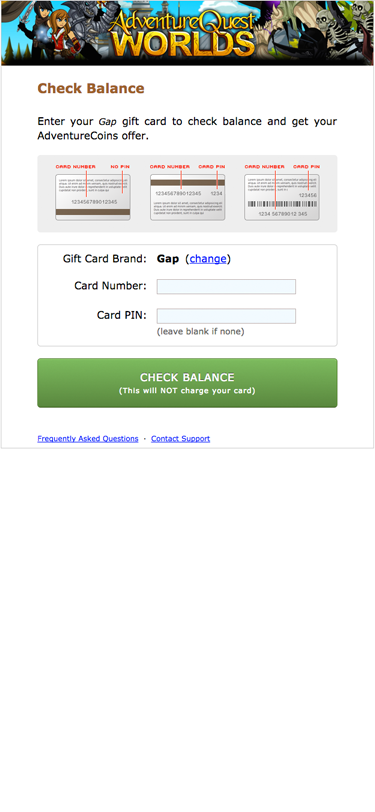
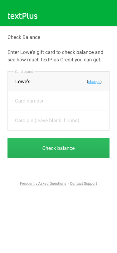
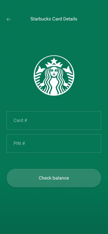
The retail branding experience extends itself to the second page of the payflow where users enter details from their gift card. I created adaptive inputs and responsive animations to give users feedback about what’s coming next, and I created illustrations to show users where to find their gift card numbers.
The level of polish and our attention to detail further enhances the amount of trust we establish at the beginning of the transaction.
Adapting to mobile
To solve PayGarden’s performance issues on mobile devices, I inverted our entire design process and designed every feature with a mobile-first approach. Instead of designing things on desktop and adjusting them to mobile, I designed them on mobile and adjusted them to desktop.
